Closing the Gap Initiative.
Educators have noticed inequitable trends among students of different genders in reading, mathematics, and science. The Closing the Gap Initiative was founded to create an educational experience that supports all students. The project created within Pinellas County Schools needs an online presence with information, impact data, and an application process as it grows outside of the county and into a statewide program.
Project Details.
Goals.
Create a responsive website that includes a resource library for educators.
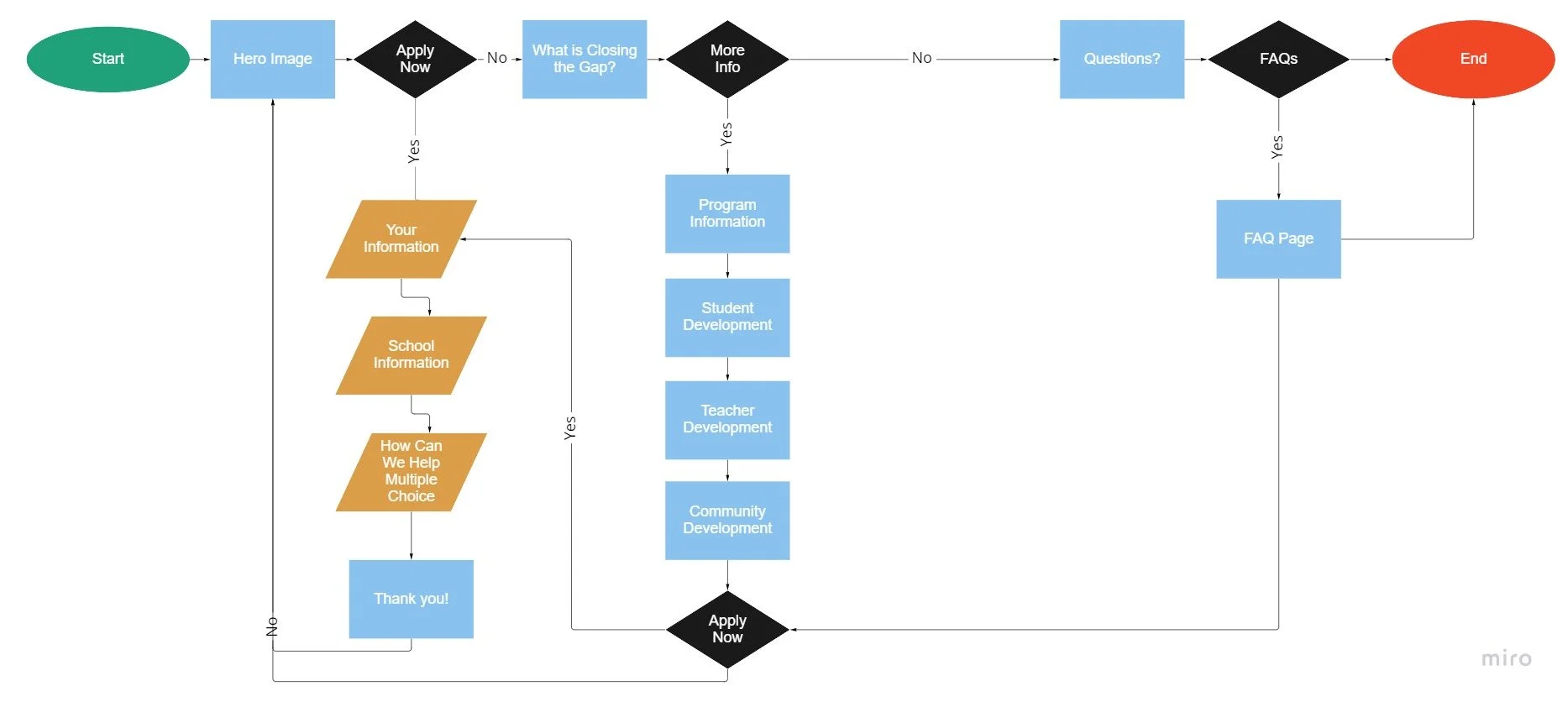
Develop an application process for interested users.
Highlight the current work of the Closing the Gap Initiative and its investors.
Team.
Alicia Abelow (Product Manager & UX/UI Designer)
Greg Abache (UI Designer)
Mathew Figueroa (Front End Coding)
Sonya Folds (UX Designer)
Tools.
Adobe XD
Adobe Photoshop
GitHub
Google Suite
Miro
VS Code
Timeline.
Timelines help to keep all collaborators organized and meet the final goal. Our time was short so we needed to stay organized and punctual.
From ideation to presentation to stakeholders we had roughly 3 weeks.
Research.
During our 1 week of research, we utilized multiple methods of understanding our users and their needs. The initiative did not currently have a website so we assessed the need for a digital presence.
12 interviews of teachers and administrators
6 educators currently participating in the initiative
6 educations not participating in the initiative
Stakeholder and donor interviews
3 GDI employees - director and two trainers
1 parent with a child in the program
1 parent without a child in the program
3 financial donors
Competitor Analysis.
Whole Brain Teaching
Strengths: The website has many free resources for teachers and administrators in video and text formats.
Weaknesses: Outdated website with unclear pathway and pricing, as well as broken links.
Gurian Institute
Strengths: Many courses, testimonials, and programs are available at a price.
Weaknesses: The website does not meet accessibility norms and has an unclear hierarchy within its cluttered navigation bars.
Learning & the Brain
Strengths: The website has many free resources with an easy registration process.
Weaknesses: No main navigation or search bar with a lot of information leaves the user overwhelmed.
Problem Statement.
Educators have noticed negative trends among their male and female students and are looking to address the inequity. We have observed that educators are interested in learning new teaching strategies through visual resources and hands-on training. As the program expands outside of Pinellas County Schools, to the rest of Florida, how will information be collected? How might we create a website that provides all the necessary information for teachers to learn these strategies and help get their classes back on track?
Solution.
We believe that by designing a website highlighting the Closing the Gap Initiative for educators, parents, and administrators they will be able to easily find the support desired and apply to be a part of the program if desired. By providing information in multiple media formats and finding new techniques to implement within their students' learning all stakeholders will feel supported.
Lo-Fi & Usability Testing.
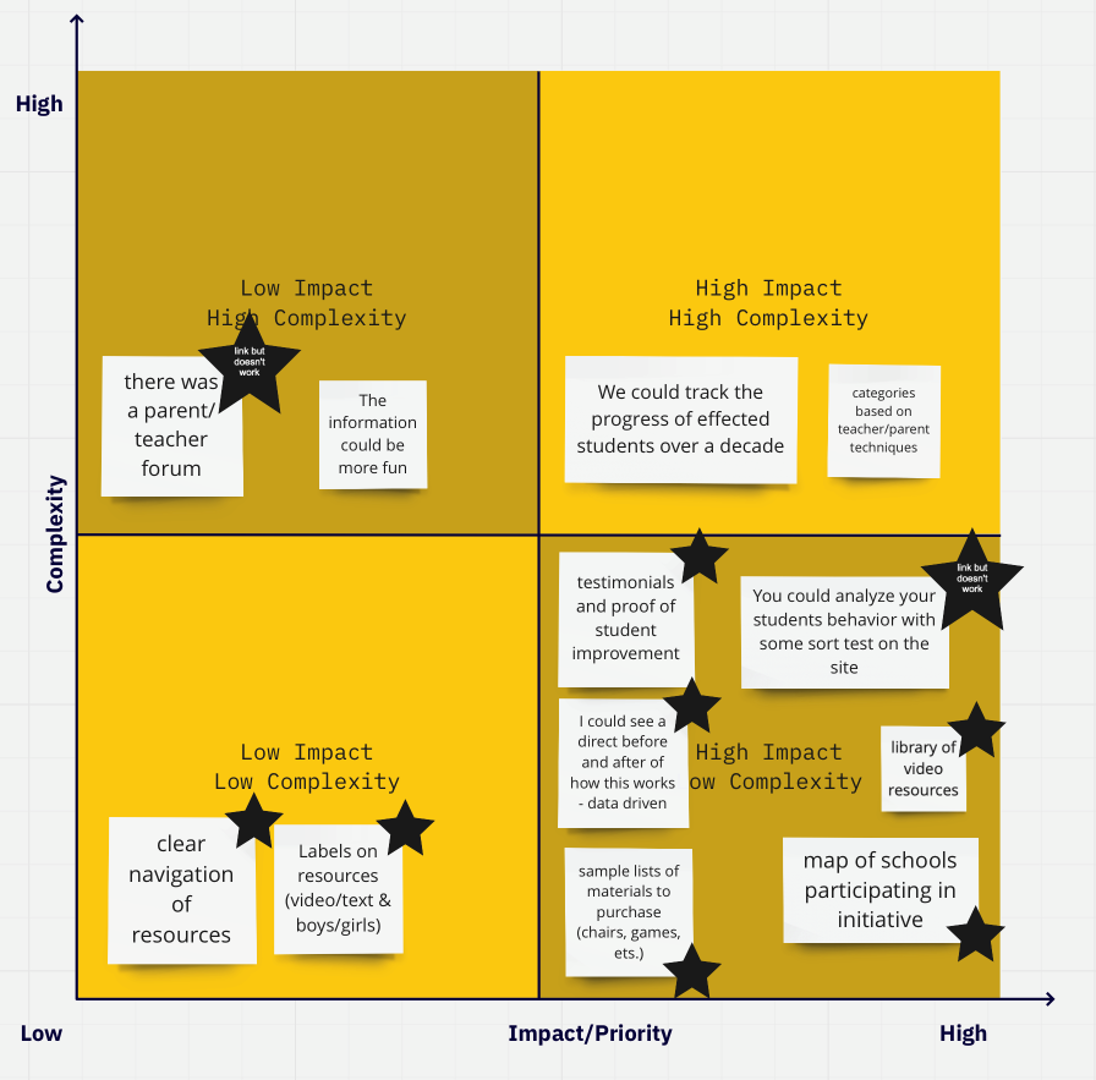
After creating our Lo-Fi we went to usability testing to make sure we had three main goals to assess the functionality of the design.
Task 1: Can you navigate to the downloadable resources? 90% success
Task 2: Can you find the Apply page in more than one way? 100% success
Task 3: Can you find the Community Development information? 50% success
The original design shown did not provide clear navigation and users reported feeling, “frustrated” and “confused” going as far as to say “I know I am in the right spot, but not sure where to click.”. In the next iteration, we changed the design to more traditional buttons with clear heading and matching iconography that is used throughout.
Final Design.
Reflection.
By working closely with the stakeholders we were able to make sure all needs were met for the company as well as its users. User testing and data analysis was the most impactful part of our process in order to achieve a design the client was approved.
As the project manager, I continued to learn how to prioritize individual strengths by assigning tasks that highlighted our individual skillsets. This allowed us to work quickly and effectively while all individuals felt valued in the collaborative process.


